Something I used to struggle with myself was how to color a digital painting which I first did in grayscale. Many people seem to be looking for the 'right' blending mode, which they can apply to their layer and just 'start coloring'. Well, there is infact such a blending mode: Multiply. Now I can hear you say: "Multiply? Nono, that can't be right. When I use multiply, my colors are never the way I pick them in the colorpicker!". Well offcourse. Infact there is no blending mode that would not change your colours because you are 'blending' them with the underlaying colors, using a specific digital blending technique. The real trick to coloring your grayscale images is to understand what a color is and how your software handles the blending.
Digital Color
A color (both digital and traditional) has 3 components; Value, Hue and Saturation. The value is the most important one (you will realise why by the end of this article). Value is basicly light and dark. When painting in grayscale, you are really painting values. Hue is the tint of the color (red, blue, green, yellow...) and saturation is how rich a color is (a very dull, almost grey red, or the reddest red you can imagine). So when you have a grayscale image, all you need to do is add hue and saturation. The the values are already done!
Here is the Photoshop color picker. It is set to H, so the hue is represented by the vertical bar to the right, and saturation and value are represented by the x and y axis of the colorfield.
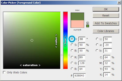
Notice how maximun value is not white. White is infact maximum value, with no saturation. This is important to realise.
Adding Hue and Saturation
Alright, to prove that Multiply is the right blending mode to use, I will demonstrate it with a little example. Below are 2 groups of 2 squares. The ones to the left are a 50% value gray and a green with 50% value and about 75% saturation. The ones to the right are two times the same 50% gray.
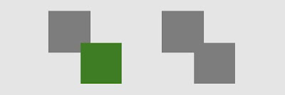
Now I want to paint over the bottom right square, using multiply, so that it becomes the exact same color as the bottom left square's. So I make a new layer above this one and set it to multiply. The only thing I need to figure out now is: "How do I pick the right color to make the final result look like the bottom left green?". Well it is really simple. We need to apply hue and saturation, right? The value has already been set in the layer below. So we set our value to maximum, and we choose the same green hue with 75% saturation. By setting our value to maximum, we don't darken up the value that is already there (this is how multiply works). For the sake of this demo I first pick the bottom left green (ofcourse you wouldn't have any color to pick in a practical example) and I set my Photoshop color palette to B (brightness; value).
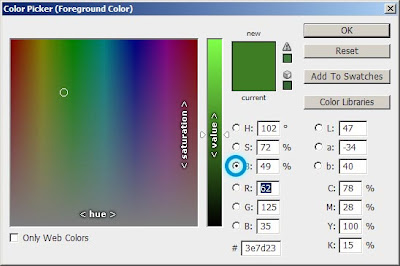
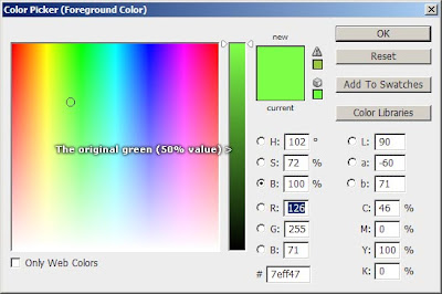
Then I set my value to maximum. Notice how in the middle of the vertical bar (50% value) is the original green. This is why setting the color palette to B is a good idea; it allows you to easily see the value range of the colors you are picking.
And now to paint over the square and... tadaa!
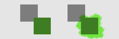
The exact same green. Go on and test it out for yourself. Use the colorpicker on the two greens when you are done, you will notice that I am not pulling your leg!
Alright so what have we learned so far? When painting over a grayscale image, we use a multiply layer and we always paint with maximum value because the right value has already been determined on the grayscale layer. All we need to do is pick the right hue and saturation to apply. For some of you this may already be enough information so go on and have some fun trying it out! For the others I will demostrate the technique a bit further with a real practical example; coloring a grayscale photo. "Why not a painting?" I don't know... I don't have a good example lying around and I don't want to be cheesy and use someone else's painting.
Practical Example: Painting a Grayscale Photo
Alright so here is a picture of myself, in grayscale.
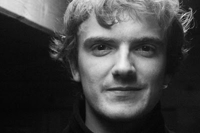
Value is the most important thing in an image. Mainly because value is what gives shapes depth. Our eyes are also very good at picking up differences in value. It is important that your painting's values really work before you start adding colour. You will find that sometimes you just can't find the right colors. Remember that this can also be due to your values not being right.
Alright, we start with adding a colorwash to our painting. We add a new multiply layer and fill it with a low-saturated pinky color. Note: Most colors in real life conditions are rather dull. Don't make the mistake of using too saturated colors. Specially at the beginning of the coloring phase.
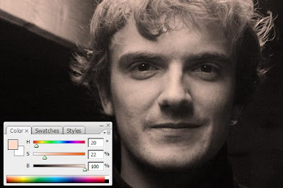
Now that we have a base skintone, we can start adding some more saturated areas with a basic round brush with rather low opacity. Places where more saturation occures:
Digital Color
A color (both digital and traditional) has 3 components; Value, Hue and Saturation. The value is the most important one (you will realise why by the end of this article). Value is basicly light and dark. When painting in grayscale, you are really painting values. Hue is the tint of the color (red, blue, green, yellow...) and saturation is how rich a color is (a very dull, almost grey red, or the reddest red you can imagine). So when you have a grayscale image, all you need to do is add hue and saturation. The the values are already done!
Here is the Photoshop color picker. It is set to H, so the hue is represented by the vertical bar to the right, and saturation and value are represented by the x and y axis of the colorfield.

Notice how maximun value is not white. White is infact maximum value, with no saturation. This is important to realise.
Adding Hue and Saturation
Alright, to prove that Multiply is the right blending mode to use, I will demonstrate it with a little example. Below are 2 groups of 2 squares. The ones to the left are a 50% value gray and a green with 50% value and about 75% saturation. The ones to the right are two times the same 50% gray.

Now I want to paint over the bottom right square, using multiply, so that it becomes the exact same color as the bottom left square's. So I make a new layer above this one and set it to multiply. The only thing I need to figure out now is: "How do I pick the right color to make the final result look like the bottom left green?". Well it is really simple. We need to apply hue and saturation, right? The value has already been set in the layer below. So we set our value to maximum, and we choose the same green hue with 75% saturation. By setting our value to maximum, we don't darken up the value that is already there (this is how multiply works). For the sake of this demo I first pick the bottom left green (ofcourse you wouldn't have any color to pick in a practical example) and I set my Photoshop color palette to B (brightness; value).

Then I set my value to maximum. Notice how in the middle of the vertical bar (50% value) is the original green. This is why setting the color palette to B is a good idea; it allows you to easily see the value range of the colors you are picking.

And now to paint over the square and... tadaa!

The exact same green. Go on and test it out for yourself. Use the colorpicker on the two greens when you are done, you will notice that I am not pulling your leg!
Alright so what have we learned so far? When painting over a grayscale image, we use a multiply layer and we always paint with maximum value because the right value has already been determined on the grayscale layer. All we need to do is pick the right hue and saturation to apply. For some of you this may already be enough information so go on and have some fun trying it out! For the others I will demostrate the technique a bit further with a real practical example; coloring a grayscale photo. "Why not a painting?" I don't know... I don't have a good example lying around and I don't want to be cheesy and use someone else's painting.
Practical Example: Painting a Grayscale Photo
Alright so here is a picture of myself, in grayscale.

Value is the most important thing in an image. Mainly because value is what gives shapes depth. Our eyes are also very good at picking up differences in value. It is important that your painting's values really work before you start adding colour. You will find that sometimes you just can't find the right colors. Remember that this can also be due to your values not being right.
Alright, we start with adding a colorwash to our painting. We add a new multiply layer and fill it with a low-saturated pinky color. Note: Most colors in real life conditions are rather dull. Don't make the mistake of using too saturated colors. Specially at the beginning of the coloring phase.

Now that we have a base skintone, we can start adding some more saturated areas with a basic round brush with rather low opacity. Places where more saturation occures:
- The darker/shadowy areas.
- Places where the skin is thinner like the tip of the nose, eyelids, cheecks.
- The lips, but don't push it. The lips are usually just a darker, redder version of the skintone.
Places where even more saturation occures:
- Places where light can shine right through (sub surface scattering) like the ears.
- The mid-values (places where the shape starts to bend away from the lightsource)
In these places, the hue also shifts to red. We should also think about our highlights. Highligts are less saturated and shift to yellow (or blue, or whatever the color of the lightsource that is making the highlight).
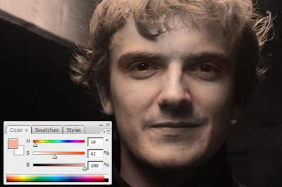
When working in color, Color Temperature is very important to keep in mind. Basicly, it means that a color makes hue shifts as you go lighter or darker. In this example, the darker areas are more red and the lighter areas more yellow. Notice how the tip of my nose is slighty more yellow, aswel as the chin and the highligts on the cheeks, while the darker areas lean much more towards red.
Tip: When you make mistakes, don't Ctrl+Z. Paint over your mistakes instead, this will give your work some nice color variation.
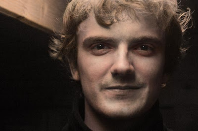
Another good thing to do is to paint a red edge around your cast shadows. This will make your shadows come to life. Don't push it too hard though, subtelty is the key.

Alright this is as far as I'll go with it. Obviously it's not that great yet but you probably get the idea. Let's have a look at our color layer!
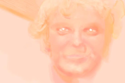
Eek! Do you see how important value is? Even though this is really blurry/scribbly, our total image still looks very tight! Note: When working like this, you can't pick colors right of your painting, because you would also pick the value. If you do need to pick a color, simply turn of your grayscale layer and pick your color from the color layer. Or you can ofcourse also pick from your painting, and set the value back to 100% afterwards.
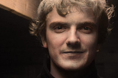
One last thing you can do is to tweak your image. You can add some hue with the 'Hue/Saturation...' tool if the image is still too dull (you should first merge your layers though).
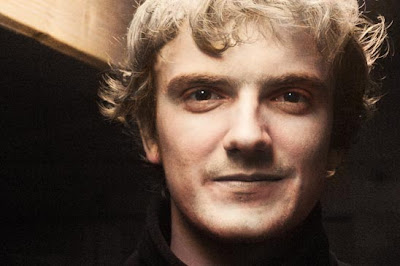
Finally, you can adjust your values a bit by adding some more contrast. This might give some extra life to your image.
Alright, so what did we learn?

When working in color, Color Temperature is very important to keep in mind. Basicly, it means that a color makes hue shifts as you go lighter or darker. In this example, the darker areas are more red and the lighter areas more yellow. Notice how the tip of my nose is slighty more yellow, aswel as the chin and the highligts on the cheeks, while the darker areas lean much more towards red.
Tip: When you make mistakes, don't Ctrl+Z. Paint over your mistakes instead, this will give your work some nice color variation.

Another good thing to do is to paint a red edge around your cast shadows. This will make your shadows come to life. Don't push it too hard though, subtelty is the key.

Alright this is as far as I'll go with it. Obviously it's not that great yet but you probably get the idea. Let's have a look at our color layer!

Eek! Do you see how important value is? Even though this is really blurry/scribbly, our total image still looks very tight! Note: When working like this, you can't pick colors right of your painting, because you would also pick the value. If you do need to pick a color, simply turn of your grayscale layer and pick your color from the color layer. Or you can ofcourse also pick from your painting, and set the value back to 100% afterwards.
One last thing you can do is to tweak your image. You can add some hue with the 'Hue/Saturation...' tool if the image is still too dull (you should first merge your layers though).

Finally, you can adjust your values a bit by adding some more contrast. This might give some extra life to your image.

Alright, so what did we learn?
- Never touch your color's value. Always have it maxed.
- If you do need to darken or lighten an area, do it in the grayscale layer. You can even use the Burn and Dodge tools.
- Apply color temperature.
- Don't over-saturate.
A Last Note
Value is what really makes a painting. If you are new to digital painting, I strongly recommend you to always start your images in grayscale. Painting directly in color requires you to really understand color theory really well and it is a hard thing to master. Many great digital painters work in grayscale first and even the old masters used value studies/underpaintings.
I hope you found this little article to be useful! Feel free to ask questions or give your opinion by commenting to this article.
Regards,
Stijn